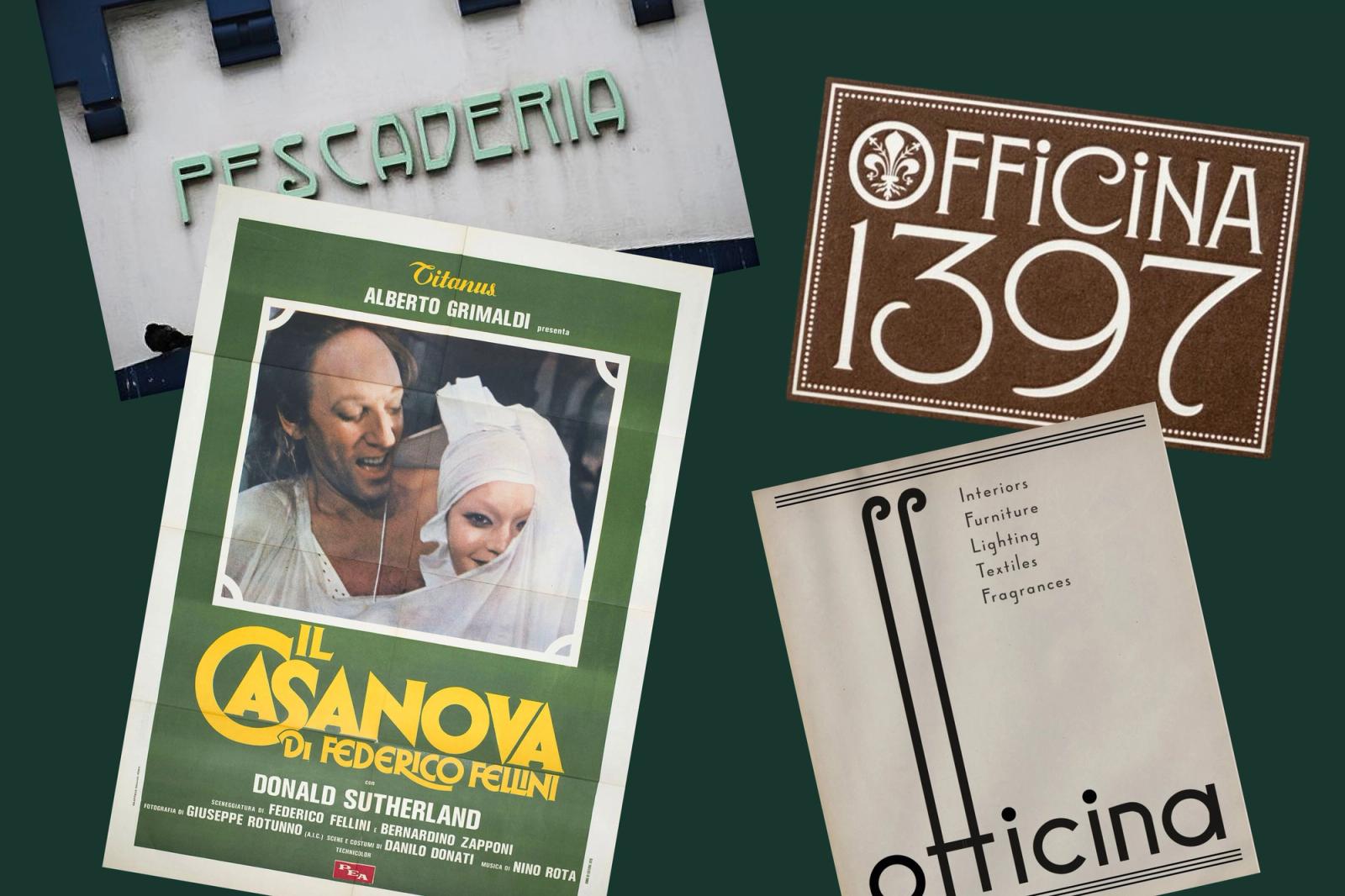
Months ago, I was working on a branding project with one of our designers for an upscale-yet-approachable restaurant concept. As is usually the case here in our creative division at Tractorbeam, we had aspirations to capture a very specific style with the identity. Our reference points were mid- or turn-of-the-century Italian street signs influenced by the research of designer Louise Fili. These documents of real Italian history were difficult enough to even find records of, much less see those influences baked into publicly available fonts that we could conveniently type our brand name into. In this case, custom type or semi-custom type (the practice of modifying existing letterforms) would be the only way to convey the kind of experience we wanted to capture in the identity.
But this isn’t always the case—sometimes a brand’s values or services are better expressed through the ready-made fonts that are available to designers, so they conveniently don’t have to agonize over the kerning pairs of, or produce alternate character sets for. Every font worth purchasing has been exhausted over long stretches of time, held up to the continuous stress and testing that ensures its quality across every kind of imaginable use case or application.
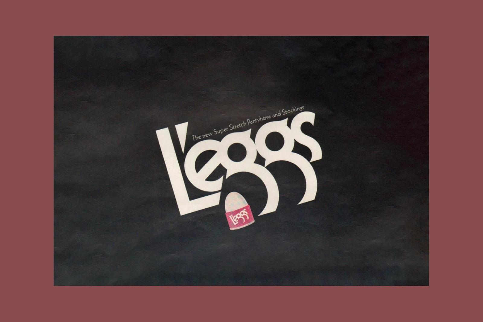
To ignore this as a resource and exclusively commit to the world of custom type would be a misstep (or misinterpretation) of the role of the designer, whose job is to communicate the brand’s values using whatever tool or process allows them to do it best.
In her recent feature for It’s Nice That, designer Elizabeth Goodspeed astutely lays out the current landscape of type design and why so many agencies are taking on this burden to produce completely custom typography. The reasons make sense: some clients want more ownership or control over their brand fonts, while others are worried about appearing too similar to a competitor who may be using the same typeface from notable foundries like Grilli or Dinamo. There is also the factor of cost, and for some fonts, subscription-based licensing (due to the influx of models like Monotype) can make purchasing some fonts untenable for smaller clients.
“With licensing growing more expensive and labyrinthine, commissioning a custom typeface offers stability and full exclusivity for a fraction of the cost.”
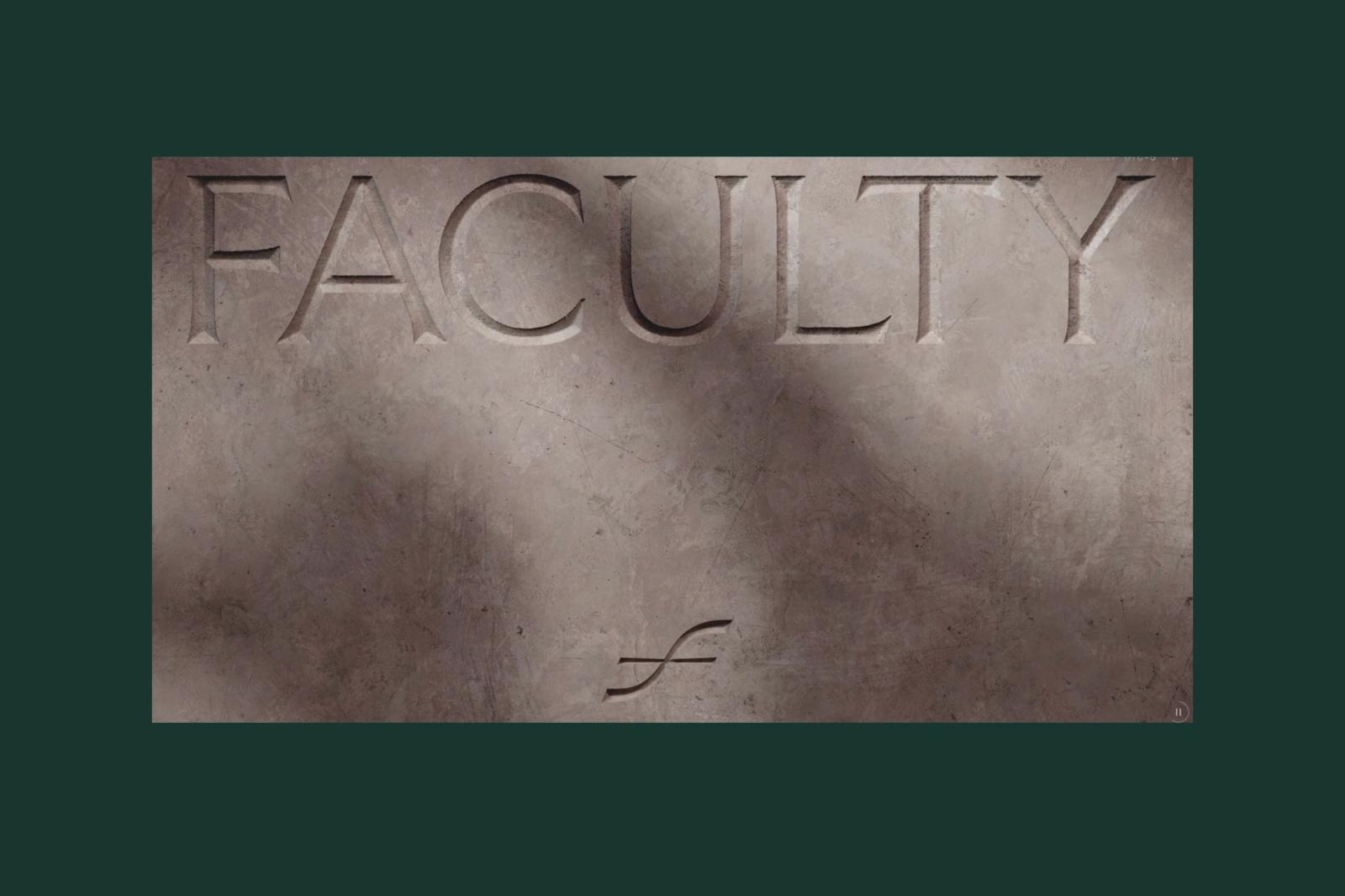
And that is all true, as the cost of typefaces and their merit continues to be challenged along with all manner of labor and artistry in general across industries in every sector. If completely custom fonts can circumvent the exorbitant licensing fees that come in addition to the labor of the designers and the strategists who develop the applications and the words that the font in question will eventually enhance, then there will always be people willing to take advantage and cut corners.
But this is not how we make decisions at Tractorbeam, because it is an inherently uncreative way to approach a problem.
Often, it is the question of “what is right for this brand, and what will help them communicate their product or service best” that becomes the crux of our decision-making process and whether or not we decide to commit to a custom approach with our typography or use any number of perfectly available fonts that meet our standards and our client’s needs simultaneously.
“Is this a B2B client that needs to portray credibility above all else?” “Is it a digitally-native brand that needs a web font that can scale across vast design systems?” “What about a boutique hotel in a 1920s industrial building that needs a logo that feels evocative of the period?” These are the places and the questions we start with as we dive into our research, the answers of which dictate whether a custom logo or an out-of-the-box wordmark is the right creative path to take.
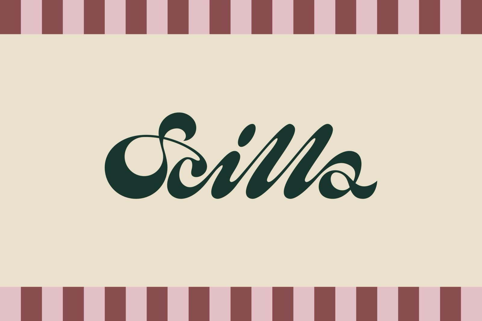
Going back to that restaurant concept mentioned in the beginning, one of the challenges that was set in front of us was to make something memorable and distinctly unique from the landscape of local Italian restaurants in the Metroplex. It was this goal and this creative brief given to us that led to the research of Louise Fili’s Italian signs and to the films of Luchino Visconti and Federico Fellini, not the stated desire to cut corners. For the next brand that comes along, one in which a custom wordmark feels incongruous to their brand’s values, we’ll take the same creative-first approach to finding the perfect typeface in order to ensure their success.